
Trusted AI #008 - My First Impressions of ChatGPT Code Interpreter
I, for one, welcome our new visualization overlords
I received access to the ChatGPT Code Interpreter plugin this weekend. Let’s play with it and see what it can do!
EDIT: A quick intro - Code Interpreter is a plugin for ChatGPT+ (you have to pay for it). It’s in “beta,” but it’s available to everyone, you just have to enable it in the options. Once done, select id from the drop-down menu and you’ll see the standard ChatGPT interface, but with two new innovations.
The interface now has an extra button where you can upload a file. It can handle a surprising variety of filetypes - text/csv/xlsx are the obvious ones, but anything python can read, it can work with. 100MB limit (but it takes a .zip file, so….) You don’t have to upload a file.
After prompting, the system will enter a “sandbox” mode where it will write the code to answer the prompt and then actually run the code; if the code fails, it will automatically analyze the code and attempt to fix the error. This can go one for several steps, and is completely automatic. This is deceptively powerful.
Experiment 1: Create a Static Visualization
I grabbed the most inscrutable dataset I know (the SP 800-53 Control Catalog...sorry, NIST friends), uploaded it, and used natural language queries to have ChatGPT perform analysis and adjust the rendering of the visuals.1 After about 30 minutes of back and forth discussion, this was the result:

I then tried for something a little more complicated, and with a little more discussion, got this clustering visualization:

My jaw hit the floor after this. It would have taken me weeks to write the Python code to do this; ChatGPT analyzed the dataset and generated the visualization, with me guiding it, in less than an hour. Keep in mind, this was all within a single conversation thread; there’s no Photoshop here, and no multiple tries.2 Final result: Critical Success.
Experiment 2: Create a Moving Visualization
If I can create a single image, why not several? Let’s try to create a GIF that loops a series of images! I grabbed some data off the Internet and graphed the market cap of 20 US companies from 2014 - 2023.
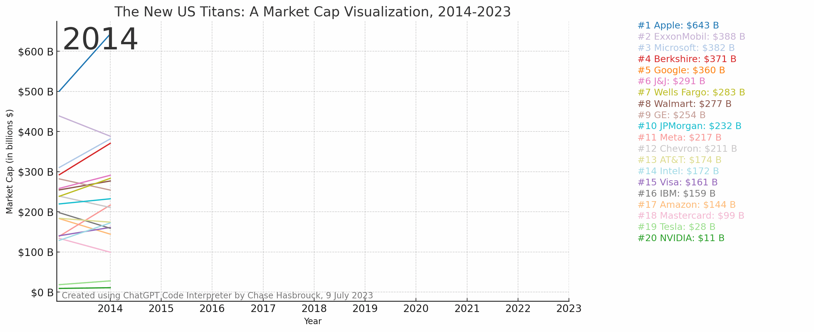
This experiment took me much longer than the single image generation, due to me making several mistakes along the way.
I meant to grab 20 companies to graph, but I grabbed 19, and didn't realize it until several steps into the process. I uploaded a new file, but ChatGPT essentially had to go back to square one with the code it was calculating, which re-introduced some bugs I had already corrected. If you need to change the dataset, it's probably better to start a new session.
Doing "visual" things is still hard. One of the created elements was clipping off of the side of the page, and ChatGPT really struggled with fixing this, because it didn't realize that the positioning was dynamic. (I told it to reduce the size of the labels to avoid clipping; it reduced the size of the labels, but the graph enlarged to compensate, causing it to still clip.) Definitely be specific about the changes you're seeing to help ChatGPT understand what you want it to do.
Reverting changes is still fraught with peril. ChatGPT will try to save time by not repeating calculations done in previous steps. If you change something in a calculation and then change your mind, ChatGPT doesn't know about it. If you do something and then decide you don't like it, don't scroll up and edit a previous response to "go back" - just tell it to revert.
This still would have taken me more time to do by hand, but not much more time. Final result: Partial Success.
Experiment 3: Create a Graphical Effect
I wanted to create a “Matrix-style” effect where a bunch of scrolling green characters moving down a display eventually turned into a message: “CREATED BY CHASE HASBROUCK WITH CHATGPT CODE INTERPRETER 9 JULY 2023”
I did not succeed.
I was able to get animated streams of text, without a message (the intent here was to have the top character in each column freeze in place at the bottom of the screen).
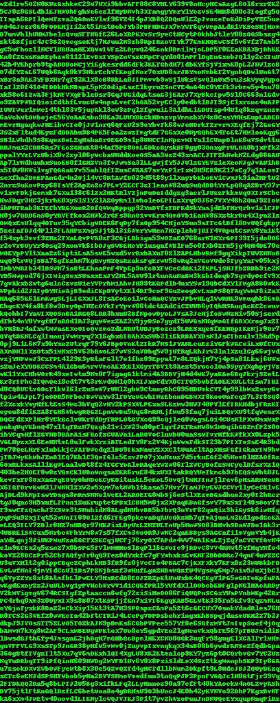
I was able to get the message, but completely different from the effect I wanted.

But I could never get those two effects together.
Here was the last attempt, which made me laugh and abandon the project. (The message is there, but as a column, not a row.)
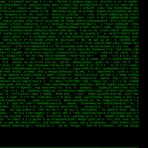
There’s a lot of exploration of Code Interpreter yet to be done. It has a lot of power, but good luck aiming it. Final result: Failure (yet hilarious).
Final Thoughts
This is a tool for the masses, not for the elites. Your Fortune 500 companies aren’t going to embrace this They will tell themselves that they already have data analysts and programmers who can do a better job than this program does…and they’re right, for now. For those that don’t have analysts and programmers, though, this is killer. I predict this is going to unlock a latent demand for data analysis and programming that hasn’t been able to be filled currently, from people who don’t even realize that simple data analysis would be helpful to them. That’s going to create some new problems, though (see below).
Even obvious revolutions take time, and this one is less obvious. I strongly believe consumer AI tech will transform society, but it will take time. The spreadsheet application VisiCalc in 1979 was the first “killer app” that drove the initial wave of PC adoption, but that was largely for businesses. It took the Internet taking off in the mid-90’s for computers to really become part of people’s daily lives across the board in the mid-2000s. I feel like this is ChatGPT’s VisiCalc moment - it’s going to see business use, but we haven’t seen the killer personal app yet. (Or, extending the metaphor, maybe ChatGPT was the VisiCalc moment, this is the Lotus 1-2-3 moment and we’re waiting on the Excel moment?)
“Fake data” will trend. The primary intuitive concern with misinformation online is faked pictures and videos; however, we’ve had so many warnings about those that I think many have internalized a healthy skepticism. I don’t think we have that with data visualizations. The default view currently seems to be “if someone took the time to graph it, it’s probably legit” which is dangerous when graphs get this easy to make. There’s going to be a lot of very bad data analysis out there.
In the end, I’m excited for this, as this is yet another tool in ChatGPT’s Swiss-army-knife capability. Detractors will complain about its limitations, but if smartphones have taught us anything, it's that lower-quality tools that are more available and intuitive will inevitably beat out their higher-quality competition for consumer use.
For further reading, Ethan Mollick has had access for a while and has a well-written post here:

Standard disclaimer: All views presented are those of the author and do not represent the views of the U.S. government or any of its components.
Here’s an example of one row. Control ID: AT-4 Control Name: Training Records Control Description: a. Document and monitor information security and privacy training activities, including security and privacy awareness training and specific role-based security and privacy training; and
b. Retain individual training records for [Assignment: organization-defined time period]. Documentation for specialized training may be maintained by individual supervisors at the discretion of the organization. The National Archives and Records Administration provides guidance on records retention for federal agencies. Related Controls: AT-2, AT-3, CP-3, IR-2, PM-14, SI-12. Yes, there are over 1,000 of these.
Here’s the chat session for proof.